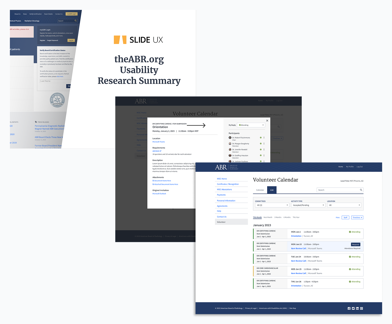
AMERICAN BOARD OF RADIOLOGY
Online certification quiz for Radiologists
My Role
UX Designer in a team of two
Client Team
Director of Analysis, Director of IT, Development team
Duration
1 year for the initial project
Scope
User Flow, Wireframes, Visual Design, Prototype, Usability Testing, Iterations, Style Guide
The Big Win
My work replaced an in-person exam that occurred every ten years with fifty two short online quiz questions per year, making it exponentially easier for physicians to maintain their certification.
The American Board of Radiology (ABR) is a non-profit organization that certifies physicians in the field of radiology.
The Interesting Bits…
I can create a simple user interface that has many invisible moving parts behind the scenes
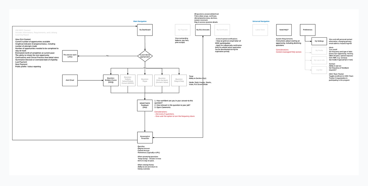
A quiz seems like a simple, straightforward flow. A question is asked, an answer is selected, a result is displayed. To the user, yes, this is how it should seem. However, there is so much more going on behind the scenes that my team had to think about. How are answers being tracked? What happens if they get a question wrong? What type of media is involved in the question, if any? What subject matter bank is it pulling from? What happens if they log in from an unsupported device? We worked with ABR to design a user flow to determine all paths that needed to be created before we dove into wireframes.
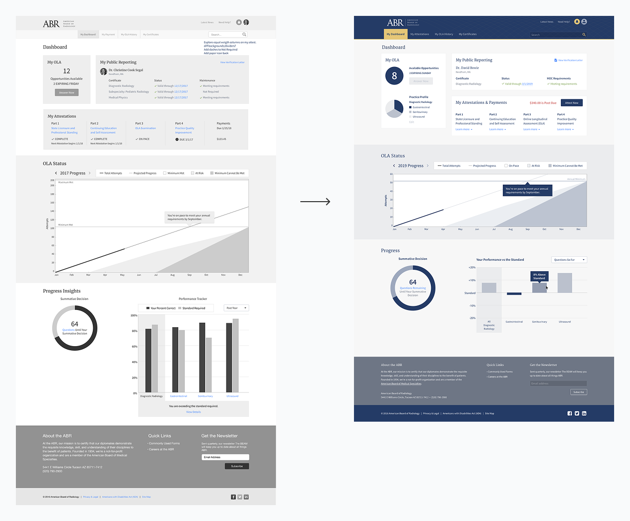
Data visualizations are only useful if they can be read at a glance
One of the most complex visualizations I had to create was the graph letting users know their progress. I had to account for how much they had done, the estimated trajectory, if they were at risk of not meeting the requirements, and if they failed for the year. On top of that, the ABR color palette was mostly shades of blue so it was tricky to create visual differentiations that weren’t too subtle.
To make the graphic easier to scan, I included the at risk and danger of failing zones and had the tracking line turn from blue to red so users could better understand the path they were on and what they had to do to get back on track.
Usability testing proved we were on the right track but we had one glaring error
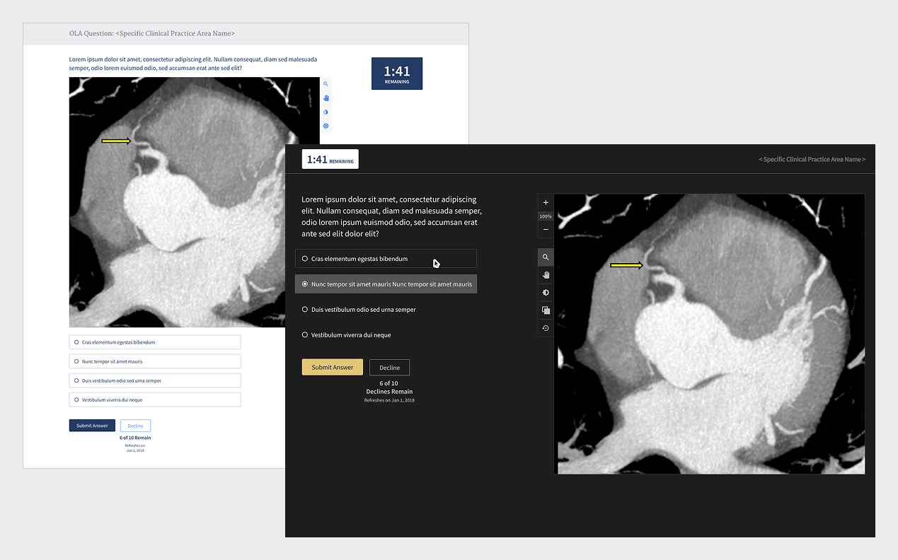
My team conducted a usability study that included six 1-hour interviews with board certified radiologists. Using a prototype of our initial designs, we found they were very excited about the idea of the quiz. Not having to travel to take a academically heavy test that rarely included walking knowledge was already a load of their backs. Data was exciting, the process was intuitive, but the one glaring error was that users didn’t want to look at a white screen because they were in a dimly lit room the majority of their day. My team took this as an aha moment and flipped the designs into dark mode to accommodate their working conditions.
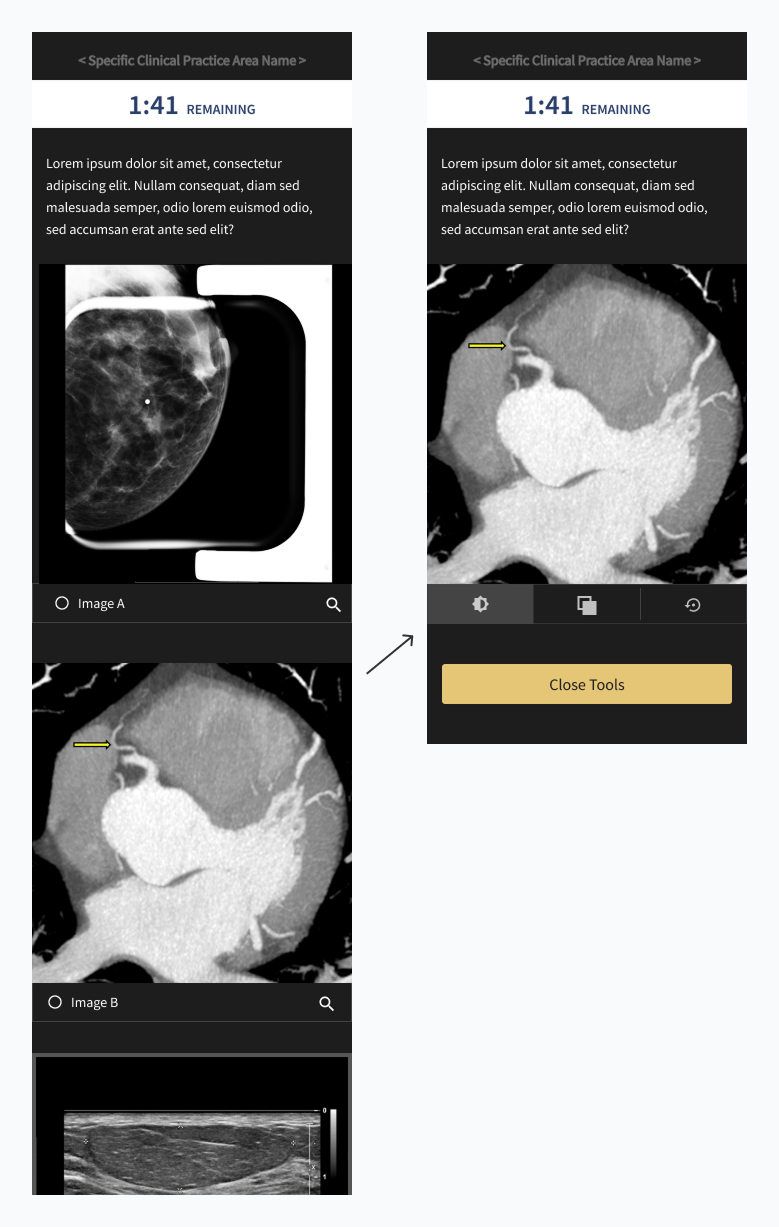
The quiz required no official UI training
Our quiz needed users to jump in and study imagery as they would in a real world scenario so we had to include the tools they would need to do so. To ensure time was spent focused on answering the question, I placed additional functionality in a prominent place near the asset and used icons that were in other ABR tools so that they were immediately recognizable.
My work was so well received that the ABR asked me to redesign several more of their products and exams
Users were over the moon about having the burden of a time intensive formal test replaced with a quiz that used applied knowledge and was easy to execute. ABR came back to my team to ask us to create the Remote Oral Exam, the Certification exam, key pages of their intranet and volunteer hub, and to conduct usability studies.
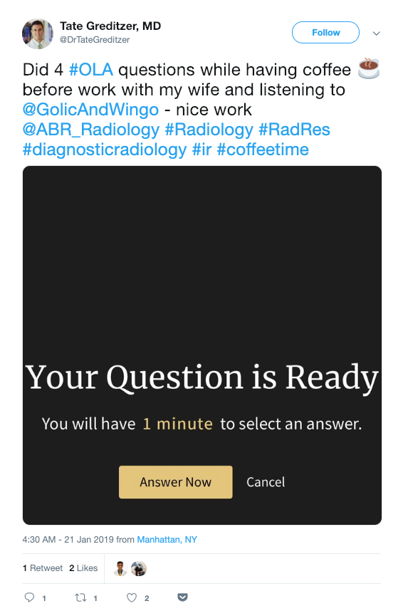
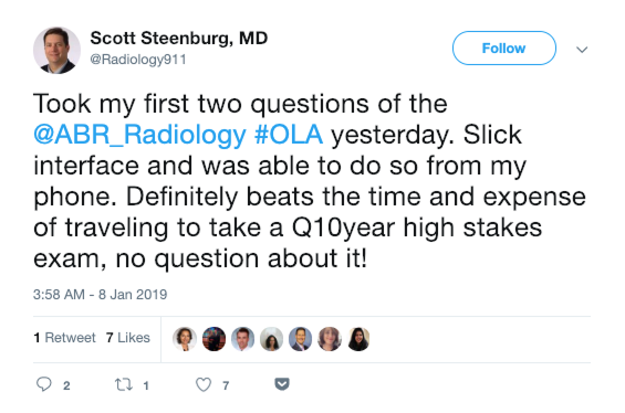
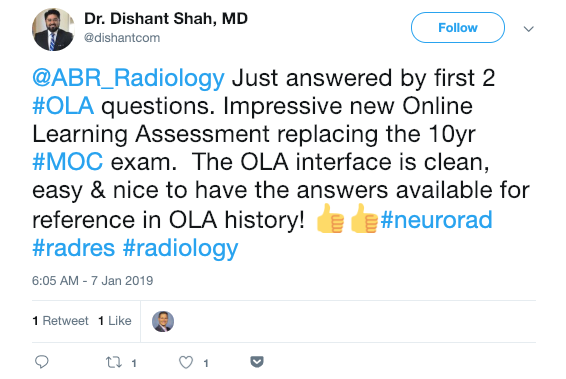
Real User Feedback
Want to know more?
Contact me at linwincreative@gmail.com