NEOLOGY
Product Design of Core Workflow
My Role
Project Lead / Senior UX Designer in a team of three
Client Team
VP and Engineering team
Duration
4 Months
Scope
Fixed Fee. Activities included discovery workshop, UX audit, user journey map, wireframes, visual concepts, visual design, prototype.
The Big Win
My team’s designs helped Neology win the largest contract in State Road and Tollway Authority’s history, which was running the toll roads in Georgia.
Neology runs the technology and services for major toll roads.
The Interesting Bits…
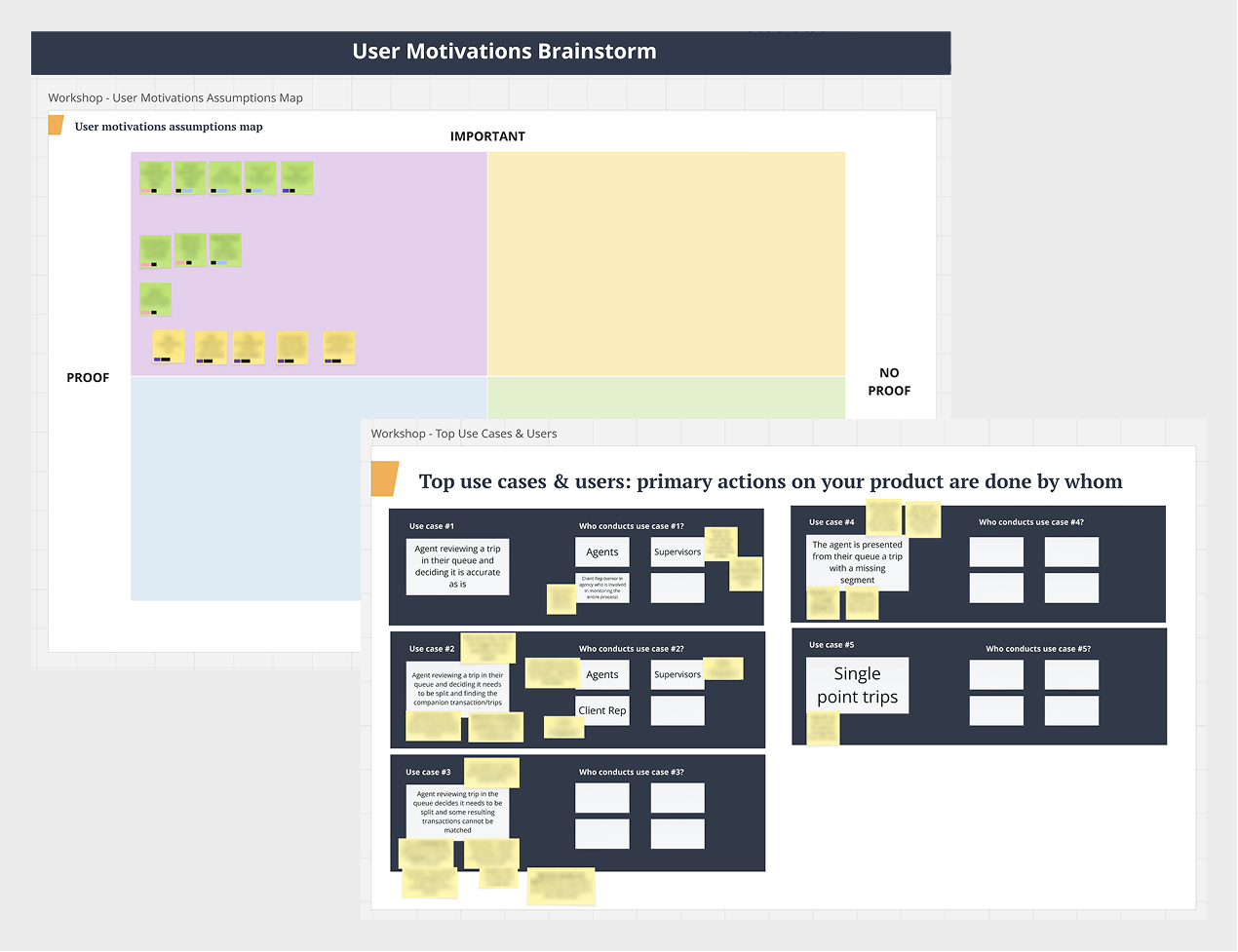
Exercises in our discovery workshop set up the project to run smoothly
The discovery workshop allowed us to dig deeper into the project’s needs, get a live demo of the existing UI, and smooth out proto-personas, user motivations, needs, and pain points. The client shared detailed text documents outlining requirements.
Through this process, we identified that there was a high user turnover so minimal training was essential. This gave us the insight that we needed to avoid layered complexity, as there were no long-term power users.
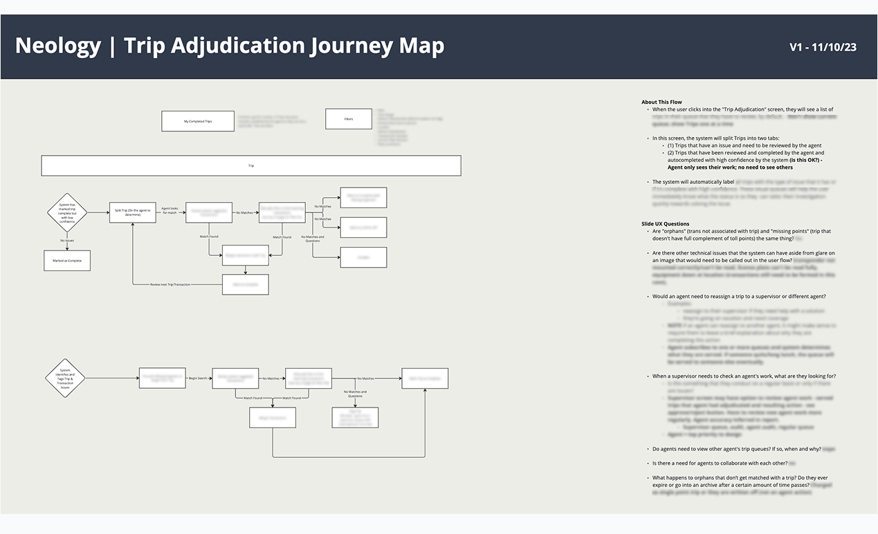
A journey map was the first step in translating the documents and current UI into a flow
After parsing through the documents and poking around in the current UI, I created a journey map so we could talk through the way the user would move through the trip adjudication process. I noted questions that came up while mapping that I discussed with the client during our weekly call.
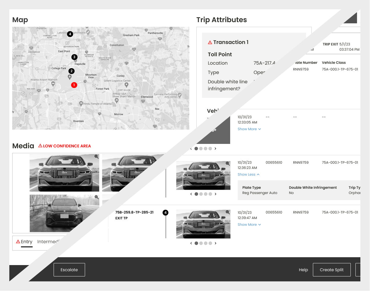
Wireframes provided a visual for the text documents which helped the client flesh out their story
I always present high fidelity wireframes to a client team because they are easier to understand and view as a webpage. Low fidelity wireframes are great when I’m in the ideating part of the process but they are hard to decipher, especially if someone on the client team is playing catch up after missing the review call.
In the meeting where I talked through our first round of high fidelity wireframes, Neology had an aha moment. Seeing their words put into a screen helped them articulate what was missing, what needed to be reworked or removed, and how content should be visually prioritized.
Iterating during the wireframe phase allowed my team to test assumptions, rearrange content, and to get client alignment before diving into the more time consuming effort of visual design. Even though I produced high fidelty wireframes, it still was a more efficient and time sensitive process to get our ideas into discussion with the client team.
My decision to add a quick visual concepting round helped give them an edge in the Georgia bid
When the project was scoped by sales, we were under the assumption branded designs were in place. We later found that the current UI was vastly under designed. Given the scale of the Georgia bid, I felt it necessary to squeeze in a quick concepting round to make the UI look professional, polished, and trustworthy. I knew my design partner and I could efficiently to get the job done.
To save time, my design partner and I had a quick huddle to recall adjectives that were used in meetings by the client and how we could translate them into visual design. We created three different concepts that we presented in one of our standing meetings. The client was happy with our approaches and decided on one to use as the basis for our designs.
Efficient processes and quick decisions allowed for more key screens to be visually design
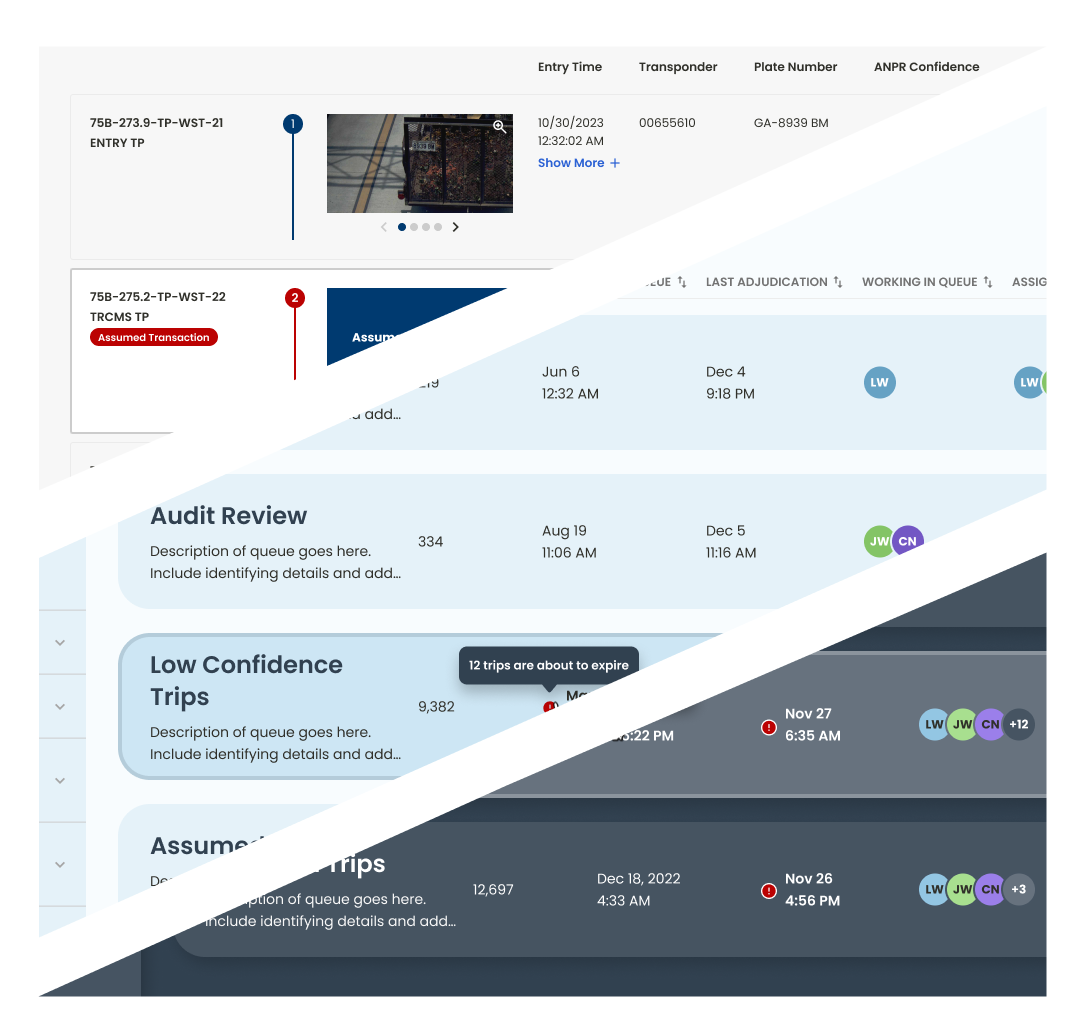
Because my team worked efficiently and our client was decisive, we were able to squeeze in designing two more key pages.
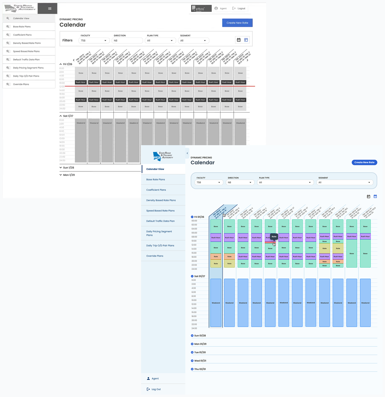
The calendar was a complicated UI and was often a page that was overlooked by their competitors. It was data rich, had long name strands that couldn’t be truncated, and required a color palette expansion to make it usable. It was a tricky task but it helped give our client an edge in their bid.
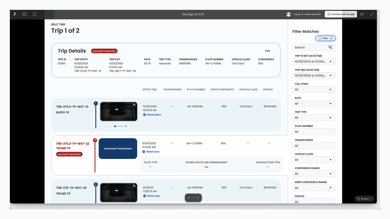
A professional prototype makes a complex story easy to tell
Prototypes can be tricky because there are usually 1px jumps that really stand out and the path forward needs to be clear to the person clicking through in a presentation. I combed through the prototype several times and corrected each jump or misalignment that surfaced.
To help the client navigate the prototype while making their pitch, I put a cursor hand to indicate next steps and key interactions and turned on the clickable highlight.
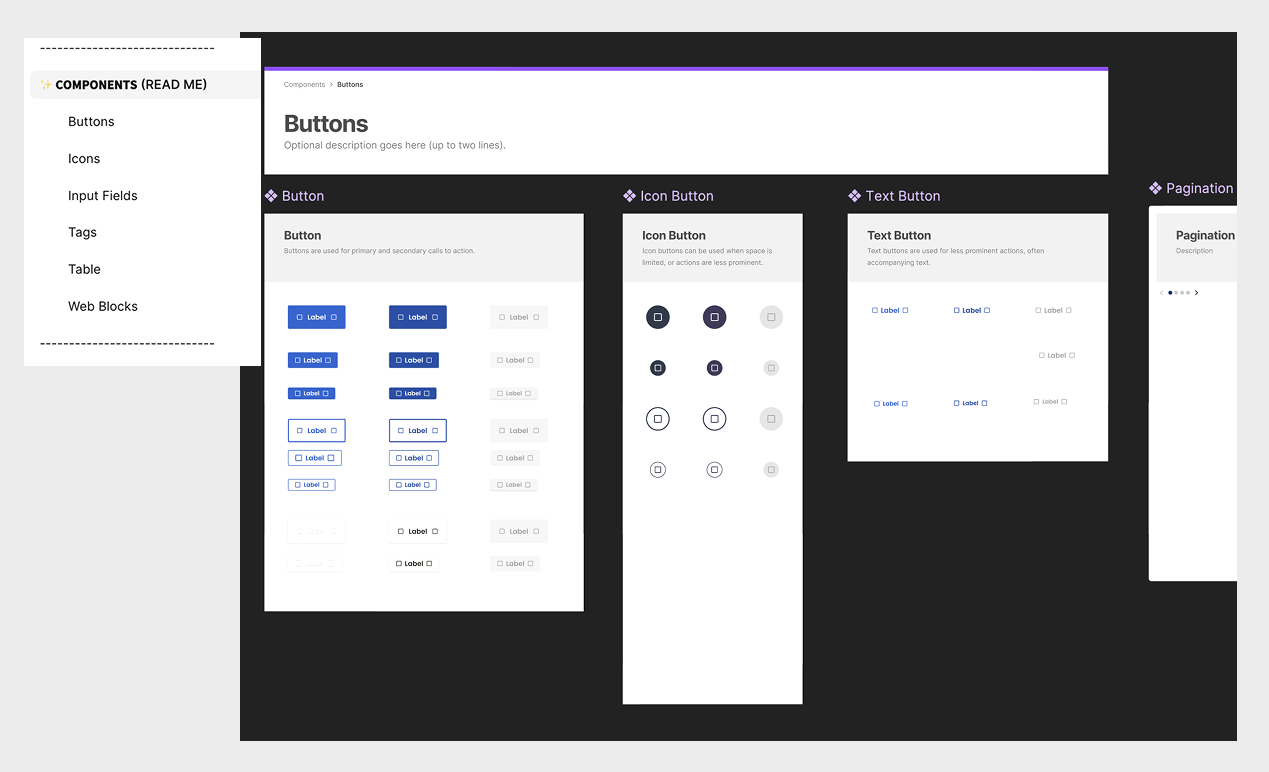
The newly designed components and templates were added to a scalable design system
We weren’t scoped to create a full design system but since we had created new patterns, we had to capture them. My team set up a Figma document that included components of all the new patterns. We created a clearly labeled, intuitive, and scalable structure for Neology to build on to in the future.
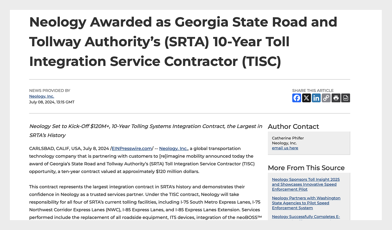
Neology wins the largest integration contract in Georgia State Road and Tollway Authority’s history
My team created user friendly, professional looking designs that made collecting and sifting through data a breeze. Clearly, the state of Georgia agreed.
A Real Client Quote
We won the (significant) client project in Georgia - SRTA (State Road & Tolling Authority). I want to let your team know that the elements we worked out with them were scored very highly and elicited positive comments from the client's scoring and technical committees.
John M. - Neology
Want to know more?
Contact me at linwincreative@gmail.com