SOLARWINDS
Website Redesign
My Role
Project Lead / Senior UX Designer in a team of three
Client Team
Marketing, UX, SEO, and Creative teams
Duration
1 year
Scope
Time and materials project. Activities included usability testing, competitive analysis, UX audit, site mapping, wireframes, visual concepts, visual design of key screens, prototype, design system integration, iterations, mentorship of their UX team
The Big Win
After two years of false starts and frustration, my team successfully identified core issues for the client and helped solve them. After nine months, Phase One of the new site was launched.
SolarWinds provides IT management software that helps businesses monitor, manage, and gain visibility into their IT environments.
The Interesting Bits…
This was no standard site redesign. During our client project kickoff call, I noticed an underlying layer of frustration and discouragement because they had been working on this project for over two years and hadn’t made any headway.
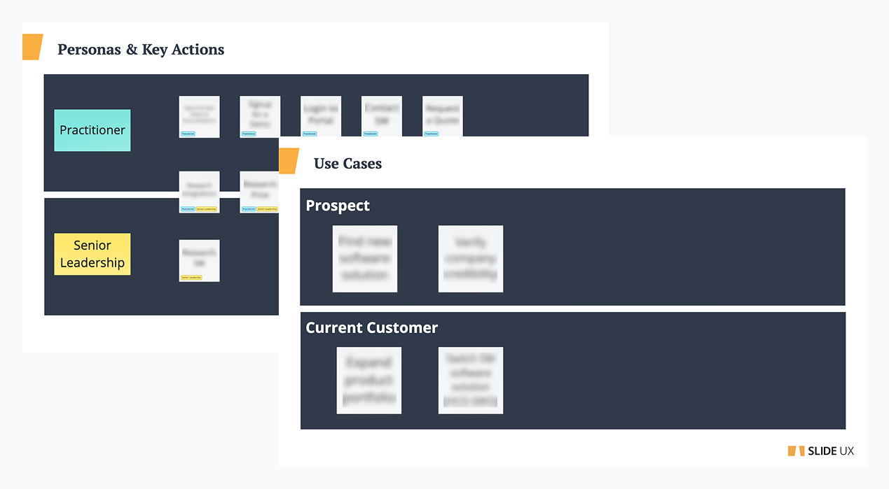
First, I listened and noted where frustrations peaked. Next, I started out as I would on any project – with discovery. We learned they didn’t have use cases outlined, which was a key component to understanding their needs. If the basics aren’t covered, then there really isn’t a foundation to the project.
Thinking through use cases and personas felt like going back to the beginning for the client team but that’s exactly what we needed to do to move the project forward.
The discovery workshop revealed that the project had no foundation
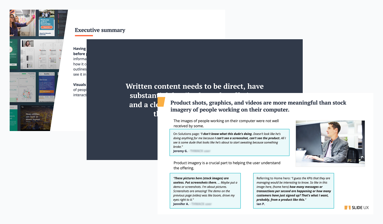
Generative research was required to discover the user journey
The Problem:
The site map was linear with lots of page repetition and dead ends. My call to action placements seemed too forward. The user journey needed to be defined.
The Research:
My team conducted ten one-hour interviews with six active and four prospective users. I led my team in recruiting efforts and scheduling. The protocol focused on discovering how the users felt about the content, what their mental model was, and uncovering what information was most important in purchasing decisions.
The Results:
We found that mainly prospective users visited the site, so asking them to make a purchase during the research phase was inappropriate. It was clear that users needed the content to be technical and direct and showcasing real product shots in order for them to make informed decisions. All current “fluff” needed to be removed.
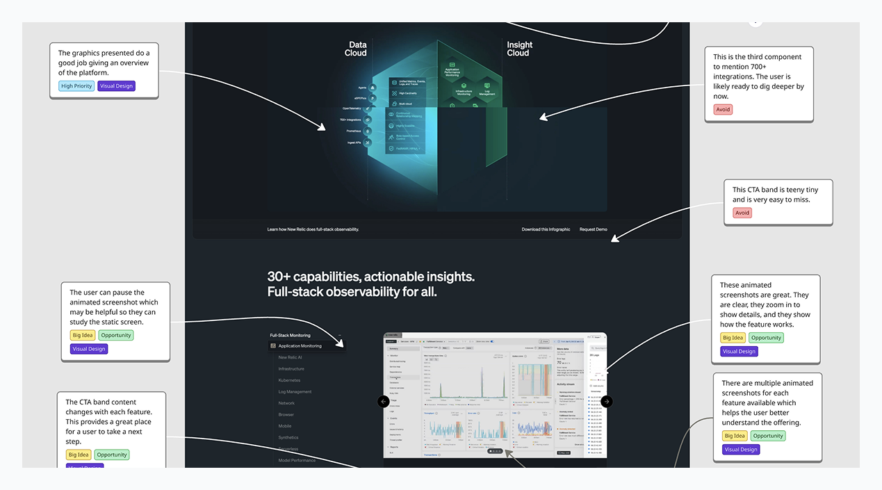
A competitive analysis helped us establish content and design goals
Looking at competitor sites helps us understand the direction the market is going, key terminology that is being used, and how we can differentiate our client. We were able to lock in on a key factor that set SolarWinds way apart from the competition and narrow down universal terminology.
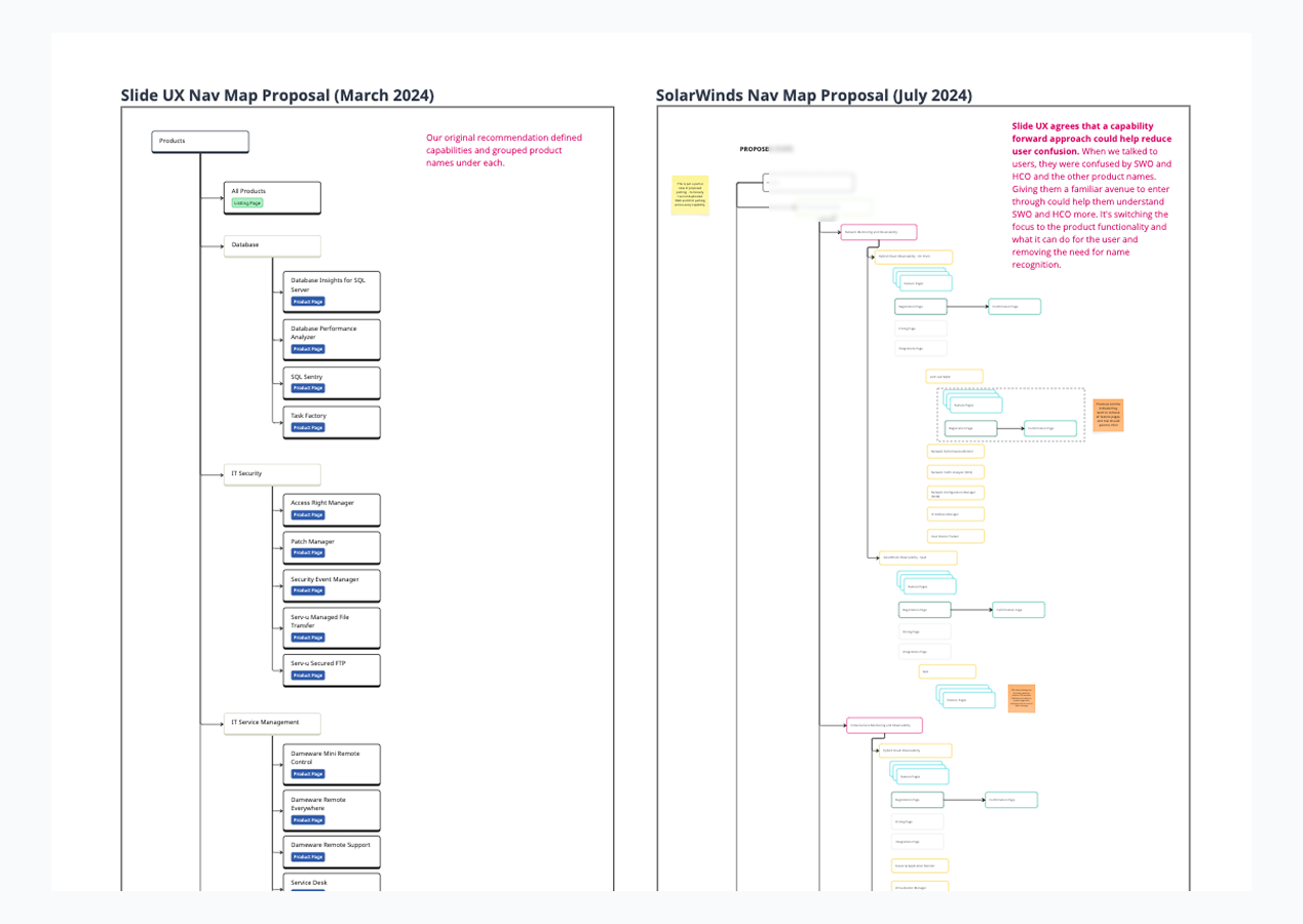
My team discovered the project blocker during site mapping and navigation wireframes
When working on the future state map and main navigation wireframes, we hit dead end after dead end. The team couldn’t confidently define their site categories. Terms like “product" and ”platform” had nebulous definitions. They mentioned their internal stakeholders and how they didn’t align with them at all. This was my team’s big aha moment. If the company can’t define what they are trying to sell, how can we sell anything?
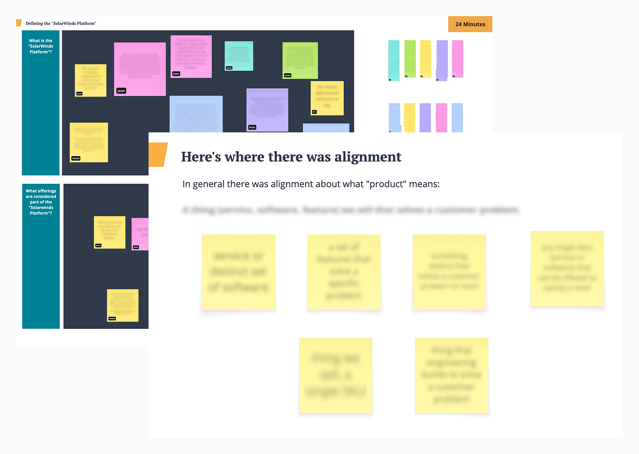
The project blocker was successfully resolved through a stakeholder workshop
I planned and led a 3-hour virtual workshop using Miro that gave space for each person to write and discuss their definitions of the key terms and for open conversation. This was a turning point in the project. The exercise showed everyone that they weren’t as far out of alignment as they initially thought.
After the workshop, the client team paused the project for about three weeks so they could finish the term definitions discussion internally. When they came back to us, their vision, goals, and story were clear and they were ready to hit the ground running.
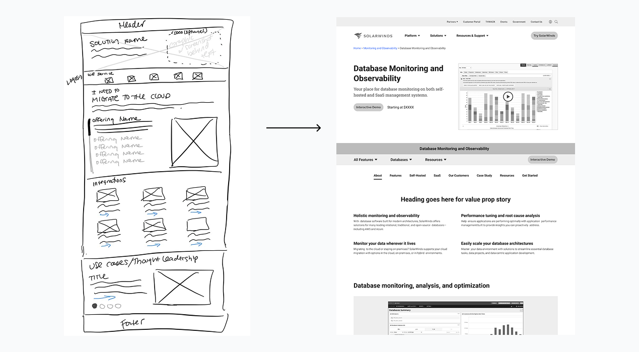
Wireframes helped us define the structure and content of each key page
n addition to integrating department goals and user needs, we had to revive the site with fresh patterns because the client team felt the site was looking “tired.” High resolution wireframes were an efficient way to discuss the new user journey and the placement of content. Before I open Figma, I always start with pen and paper to get rough ideas out. This helps me weed out the bad ideas and creates a base for me to work from in Figma for the good ones.
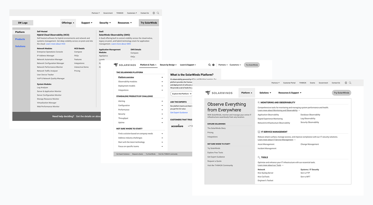
Iteration is important and it’s my job to make sure we don’t get stuck running in circles
Iterations should move the ball forward with each round, and did once we got past the main navigation. Before the workshop, the main navigation iterations were unfocused and changed wildly each time, which indicated to my team that there was a deeper problem that needed to be addressed.
Two to four rounds of iteration for each screen usually suffices, depending on how in depth the screen is. Once the client starts making small tweaks like changing a word here and there or with spacing, I know it’s ok to make it ready for visual design, where many of these tweaks can be made.
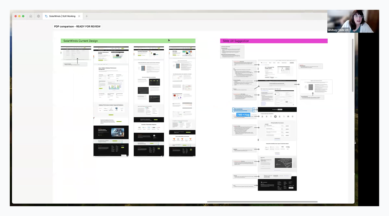
Conducting a current site audit aided in our conversation about key screen templates
Some of the key screens that my team was going to design either had several different version on the live site or we were taking content from different pages to create a new screen. Being able to dig into the current content and page flow made it easier to understand how to structure the new templates. In my conversation with the client team, I showed the current screens next to our newly designed wireframe that had call-outs explaining our design decisions. The visual comparison helped the team identify content that needed to be prioritized or removed.
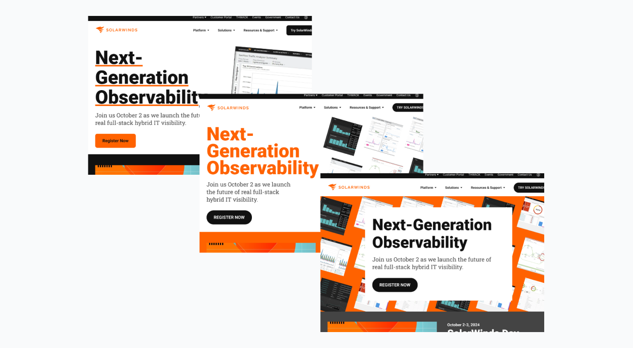
Collaboration with the SolarWinds creative team was key to a successful homepage visual concepting round
While designing concepts with the existing branding for the new look and feel of the site, it became clear their lead creative, who had a long tenure at the company, wanted to give his two cents. Instead of claiming complete ownership of the process, we kept the door open for him to participate and explore his own designs. When the components were decided upon by the client team, I married our homepage designs together and made sure it followed UX best practices.
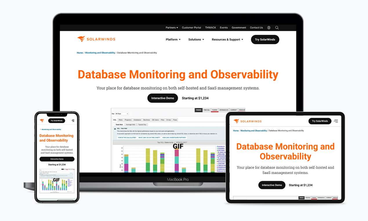
In under a year, the site redesign went live and the design system was expanded
The client received fully thought out designs of nine key page templates, main and sub navigations, two reusable page components, CTA variants, a guide to how colors should be applied, and a future state map to use as a reference. We used their existing design system that the client UX team owned and grids so the transition into their library was seamless.
Our last client meeting literally had them in happy tears. It was a long journey for them; I’m glad that my team and I could help bring them down the road to success!
Mentoring the Client’s Internal UX Team
The SolarWinds UX team had mainly been tasked with production work for years but with the new site coming out, they needed to ramp up their UX skills.
Throughout this project, my team and I led a weekly meeting to discuss design issues they were facing outside our project and to give them short homework assignments. They created a site map, completed a competitive analysis exercise, and were able to go behind the scenes with us when we performed our usability testing.
When the project wrapped, the client UX team expressed that they felt more prepared and ready to face new UX challenges. I enjoyed the opportunity to talk shop with other UXers and helping them gain confidence in their abilities.
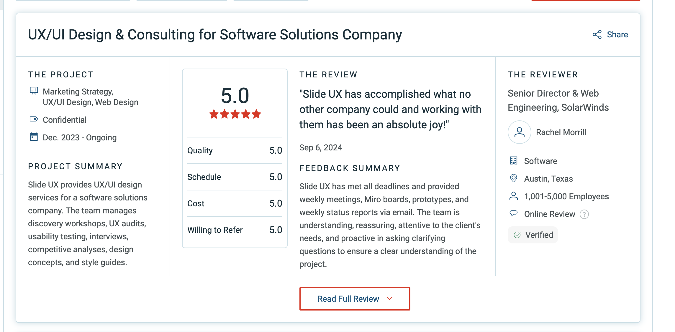
A Real Client Review
Want to know more?
Contact me at linwincreative@gmail.com